Graphic design – particularly for the web – changes at a notoriously fast pace. What may have been considered vogue one month, can be deemed as practically prehistoric just a few months down the line.
If you’re a student at graphic design school, you’ll be kept abreast of all the latest in graphic design trends. Still, it always pays to keep your finger on the pulse. In order to help you stay ahead of the game, here are the graphic design trends that are hot right now and likely to become industry-wide practices over the rest of 2015…
Hottest Graphic Design Trends For 2015
Grid Layouts
Almost directly attributable to the rise of Pinterest (and to a lesser extent Instagram), the clean-cut ode to order has become prevalent with many graphic designers opting for grid layouts in 2015. Web designers around the world have exhaled a sigh of relief at this latest graphic design trend given that it’s fairly easy to implement into a working site through basic CSS.
Obviously it doesn’t isn’t suitable for the presentation of all kinds of content, but it does work great for graphic designers working on product-based presentation or content that is highly categorized. This is the ultimate graphic design trend for the OCD sufferers among you.
Flat Designs
Flat, simple, and minimalist is the most recent graphic design trend to have just started emerging this year. As such, there’s never been a better time to adopt it into your own work.
The good news is that it’s a delightfully simple style to execute, given that it purposefully steers away from any kind of graphical frills or embellishments. Keep it nice and simple, put a self-imposed ban on using the gradient tool, and leave those edges gloriously unbeveled. Blocking primary colors help seal the deal (just make sure you export any digital work on the highest DPI settings / lowest compression in order to keep those edges crisp and avoid unwanted noise.)
Optical Illusions
This one seems to be becoming prevalent in logo design this year, with numerous companies adding visual trickery to their branding in order to get people’s attention and keep them engaged.
And it does work… when done well.
The above Sonos logo is a great example of this and has since gone viral, even though the pulsating effect you get when scrolling was a lucky accident on behalf of the graphic design team.
When it’s forced, it can serve to distract the onlooker and can end up being a hot mess, minus the hot.
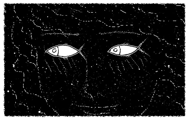
Ethereal Pastels
If you’re in game design school, or work as a graphic designer specifically for video game media, this is the one graphic design trend of 2015 you really need to know about. In previous years, we’ve seen very loud, busy, and often cartoon-esque visuals in video games (particularly in the mobile sector).
In recent times, however, a handful of superb titles have pushed gaming trends towards the more experimental ‘relax-em-up’ type of game. To suit these, an almost unique brand of ethereal, vivid landscape imagery was created to mirror the gameplay.
Indie success stories like Proteus (pictured above) kicked things off in 2013, and the rise of the casual gaming market (again, particularly on mobile platforms) helped the style gain momentum. More recently, the award-winning Monument Valley and hugely enjoyable Alto’s Adventure both employ this flavor of graphic design.
And although it’s been a mainstay of cult artists and fans for some time, pixel art is increasingly becoming a mainstream style. Of course, there’s a single game that is responsible for bringing retro-style video game art back to the fore; it begins with ‘M’, and ends in ‘Craft’.
Got any other graphic design trends you’re embracing (or loathing) in 2015? Hit us up in the comments below, and let’s get some discussion flowing!