With over 50,000 apps and an additional 20,000 games submitted to the iTunes App Store every month, it’s never been more desirable to have an icon that not only grabs a casual browser’s attention but also communicates everything the app is about. After all, aside from a title, the icon is pretty much the only thing you’ve got to entice people to want to know more.
Whether you’re trying to make your own app stand out from the crowd or are looking to gain icon design work from publishers, there are definitely rights and wrongs to bear in mind when designing an icon.
Today, we’re looking at the right ways to make your icon … well, iconic.
Creating an Icon: The Process from Start to Finish
First up, you’ll want to take a look at two very important design guides: the one for iOS and the one for Android. While the design principles remain the same (and you’ll likely use the same iconography for both stores), there are subtle differences in the required technical specifications for your final images.
Ready to go? Then let’s move on to:
Scoping the Competition
We’re going to assume for a moment that your app has at least a little competition and that there are similar apps already out there. If your app is a one-of-a-kind original serving a niche that nobody else has capitalized on yet, well done!
Otherwise, take an impartial look at your competition and see which icons look most appealing as you scan down the app store. Don’t think about it too much, just note down the ones which particularly leap out at you. When you go back and re-examine the list with a more critical eye, we can guarantee that the ones you ignored went with the safe and obvious design choices, while the others did something a little different (though still clearly communicating the app’s function).
Don’t be afraid to take things in a different direction – as long as the app’s purpose is clearly defined through the icon, you can go as abstract as you like. A few other useful things to bear in mind:
Universal Appeal: Whatever imagery you use, make sure it won’t cause confusion (or worse, offense) in any other culture or country.
Focus on the Main Feature: Another to-do app that stands out from the masses is Swipes. Coupled with the name itself, this is an icon that conveys exactly what you can expect from the app:
So, if in doubt, focus on either a) the app’s selling point, or b) the app’s major function, and you’ll be starting on solid ground.
As for the design itself…
Settling on Color
Firstly, go monochrome. That’s right: design your icon in black and white first. Because if it still works without any color embellishment, you’ve almost definitely got a strong design.
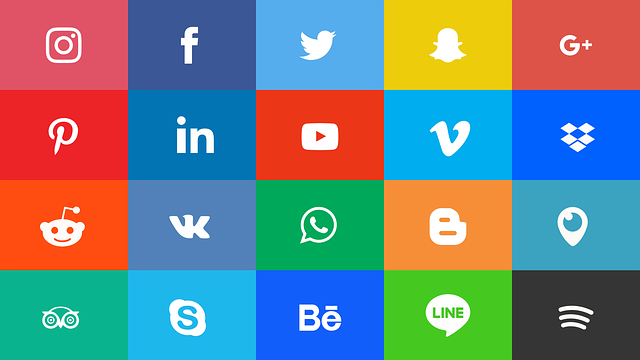
When it comes to implementing some hues, however, it pays to look at the wider industry. With the exception of Snapchat (one of the very few ultra-popular apps to have a yellow icon) and a handful of greens, the overwhelming majority of apps fall into either the red or blue spectrums. Virtually zero inhabit the tertiary colors in between.
There’s nothing to say you can’t buck this trend with your own magenta-meets-bottle-green design, but know that countless millions of marketing dollars have been spent by the companies above in figuring out what consumers respond to best.
And lastly, the golden rule of icon design:
Trim the Fat
Once you’ve got a rough idea of how you want your icon to look and perhaps even a few drafts in the bag, it’s time to pare it down as much as you can before the message starts getting lost.
Got text in your icon? Try one letter only, a la the Vine, Tumblr or Facebook icons (which use the first letter of the app along with strong typography to get the brand across). There are a few apps that break with tradition, but on the whole it adds way too much visual noise and doesn’t lend itself well to scaling.
Going back to color, it’s optimal to stick to two complementary colors. The exception to this rule of thumb is with gaming apps, in which a multitude of colors (usually representing a sprite or scene in the game) is the norm.
In short: keep the design simple and the message clear.
Happy designing!
PS: As a closing tip, always work in vectors for easy, loss-free scaling. You’ll want to export your finished design in a number of different sizes, since a 120x120px logo scaled up rarely looks good!