Color is a seemingly magical tool, and a hugely important asset in the cinematographer’s toolbox for conveying a particular mood and eliciting the desired emotions in a movie’s audience.
Of course, it isn’t really magic—the science behind which colors work well together on film and the effects they create are taught at cinematography school 101, and the theory behind color design is well established at this point in the history of cinema.
That said, it’s always good to refresh that knowledge from time to time, especially since it’s an integral part of effective filmmaking. Today, we’ll be looking at:
Color Design in Film: 5 Important Things to Consider

1. Know This Well
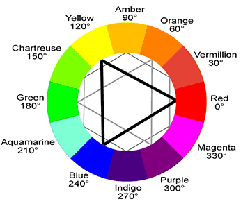
The color wheel above is an iconic representation of the red, yellow, blue—or subtractive—color model, and is an essential concept in pretty much any field of the visual arts and cinematography is no exception.
Learn this like the back of your hand, though there’s no harm in keeping a reference card in your field kit bag. Or pinned up in the edit room. Or superglued to the back of the assistant DP’s head. Everywhere, really.
But equally important is knowing what to do with it. Moving on to:
2. Color Temperature
Looking back to the color wheel, you’ll see that colors running clockwise 90 to 270 degrees—i.e. the right-hand side—are predominantly warmer than those on the left-hand side. The upshot of this is that scenes which feature warmer colors are more lively and energetic, while the ‘cooler’ colors give the impression of stillness, and calm and somberness when applied to film.
It’s a fairly basic principle, but the results of applying warm and cold colors effectively really do speak for themselves. Check out this scene from The Dark Knight, which features a heavy amount of graytones and cobalt blue and the effect it has on the overall mood:
Notice also in the above scene that the cold colors play very well against the fire and blood. Given that you won’t want to just use either warm and cold palettes all the time, let’s explore…
3. Creating Contrast With Opposing Colors
Any two colors that lie opposite each other on the color wheel can be used together to create a real vibrancy to a scene, particularly when it comes to pairing a warm and a cool color. A good demonstration of this can be found in Ang Lee’s Life of Pi—really, any Ang Lee movie viewed with a cinematographer’s eye will teach you volumes about effective color design:
You’ll likely have to carefully balance saturation and contrast in the editing suite when putting together two very vibrant and opposite colors, but the payoff can be more than worth the time it takes to get it right. That all said…
4. Know When to Dial It Back
Just because two or more colors work well together doesn’t mean you necessarily have to push them to the limit and oversaturate them. In fact, sometimes the best color design can be found in moderation.
If you think back on any of Tim Burton’s movies, you’ll notice they have the strange knack of giving the impression of both vivid color as well as a macabre, washed-out look… all at the same time.
It’s an exceptionally clever trick, mainly achieved by keeping most of the key characters and majority of the scenery on a grayscale but applying bright color design to secondary elements (almost the reverse of common convention.) Here’s a clip from the iconic Edward Scissorhands:
And finally…
5. Mix & Match
While all of the above can be considered conventional wisdom, that doesn’t mean you shouldn’t feel free to experiment with color combinations. A lot of great cinematography has been born out of experimentation, so bend the rules and see what happens—using colder colors for a romantic scene to create a contrasting and jarring effect, for instance, or mixing two colors that don’t typically work in order to make the cinematography feel alien and unsettling.
Your experimentation won’t always work, but there’s certainly no harm in trying (and the more you discover what doesn’t work, the more you’ll intuitively get a handle on what does.)

