
Colors affect us. Whether we’re picking a dress for a party, buying a gift or shopping for daily groceries, we often make instant decisions based on color. Certain colors have particular meanings in specific contexts which we have grown accustomed to — the red for traffic lights is different from the red that splatters Valentine’s Day products. Similarly, the color green is used simultaneously in marketing related to finances as well as in environmental activism. But color psychology is more than about knowing your client’s favorite color or using stereotypical color associations when branding or marketing products. It is about using certain colors to effectively market a brand and subtly persuade the customer to trust it, thereby influencing their purchasing decisions.
As per a 2006 study, 90 percent of our instant judgments about products are based on color alone, which makes it very important to align the brand’s identity and personality with an appropriate color. But doing so can be difficult, because not only does a particular color have a myriad of meanings and associations (sometimes even contradictory ones), but also because an individual’s response to a color is shaped by their subjective personal experiences.
Keeping in mind these difficulties, we bring you some helpful tips on how to effectively use color psychology in your graphic design projects.
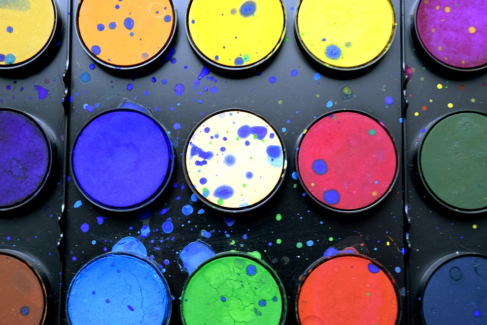
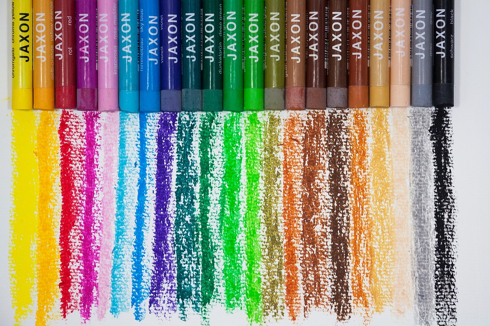
1. Learn about color theory: Colors don’t exist in isolation. Unless you’re working strictly in black and white, chances are you’ll be mixing different colors or even similar shades of colors in your design work. Color theory will teach you about primary, secondary and tertiary colors and guide you to the most effective specific color combinations. Whatever you’re designing, choosing the right combination of colors from a color wheel, will go a long way in making your design effective and eye-catching.
To aid with this, there are online resources, like this great color wheel tool from Canva, to help you use color theory when designing.
2. Research on colors used by similar brands: Knowing the traditional associations of a particular color may be useful, but it’s more effective to research what colors that brands similar to the one you’re designing for, use. For instance, did you notice that Facebook, Twitter, WordPress and Vimeo all use blue in their logos? Or that both Nikon and National Geographic use yellow in branding? So whatever project you’re working on, take a look at the colors that major brands use and then you can decide whether you’ll stick to the same color or do something very different.
3. Keep in mind the “Isolation Effect”: Items that “stick out like a sore thumb” are more likely to be remembered. In other words, make sure your product is eye catching. So when designing, keep in mind the environment and lighting of the place where it will be displayed. So think of ways in which you can ensure the colors of the product can harmoniously blend with the surroundings as well as be noticed by the average customer.
4. Use descriptive color names: This is particularly important if you’re doing work in the fashion or cosmetics industry, where the descriptive name of a color can work wonders. For example, sky-blue is preferable to light blue, just as mocha works way better than brown. Think of the associations and metaphors you want a particular color to evoke and use creative and unusual names accordingly.
5. Don’t ignore your personal judgment: Don’t put so much emphasis on theory that you end up ignoring your practical reality. If for instance your research tells you that yellow is the best color, but your own response to it is that the color won’t work as well as say orange, follow your own judgment. Place yourself in a customer’s shoes and think accordingly. In other words, assess the effectiveness of your design from multiple angles and pay attention to your own intuition. As perception to color is very psychological, it is very very important that you don’t ignore your own hunches.
In short, although color psychology can appear ambivalent at first, is very important in graphic design and using it well, takes practice and you might have to do it in a trial and error way. But once you get the hang of it, it will pay off excellently!
Are you interested in graphic design? Learn more about the New York Film Academy’s Graphic Design School.