When you think ‘balance,’ an image may come to mind of a scale, equally weighted on both sides. When it comes to photographs, balance doesn’t necessarily mean that the photograph is symmetrical. Rather than being perfectly symmetrical, a ‘balanced’ photograph often means that the photograph is balanced in other ways throughout the composition. The varying tones, texture, and shape within a composition all have a lightness and heaviness that contributes to the overall balance of the photo. In order to have a balanced photograph, all of these aspects must be in harmony with each other.
A balanced photograph often allows the viewer’s eye to be drawn throughout the image equally, without resting too heavily on one certain aspect of the image. Photographs that are improperly balanced are often less appealing to look at, especially if the ‘heavier’ part of the image lies too far left or right. Below we take a look at five kinds of photography balance you need to understand to take appealing photographs.
Symmetrical Balance
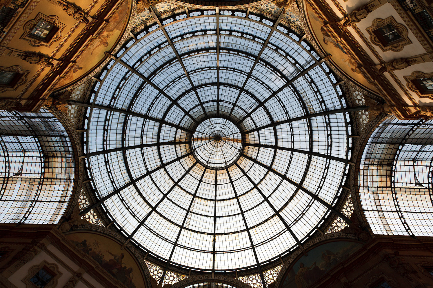
While not all balanced photographs are symmetrical, all symmetrical photographs are balanced. Symmetry (also known as formal balance) is achieved when both sides of the image hold equal weight. Photographers have creative license to take this ‘symmetry’ as literally or as figuratively as they please, as you can see by the two examples below. Each photograph is equally balanced if split down the middle, yet one is literally symmetrical and the other uses different elements of the composition to appear symmetrical.
Asymmetrical Balance
Known alternatively as informal balance, asymmetrical balance is a bit more difficult to achieve. The more you are consciously aware of asymmetrical balance in your own personal compositions, the easier it will become in your daily practice. Many professional photographers prefer asymmetrical balance due to the complexity of the image. When an image is symmetrically balanced, that symmetry is initially obvious to the viewer. However, when an image is asymmetrically balanced, the viewer has to spend a little more time looking at the image in order to realize that fact. Instead of mirror images or an equal weight on each side of the photograph, the image is balanced by the creative use of size, tone, and form of the subjects within the composition. Each side of the photograph, in turn, becomes equally weighted regardless of their differences.
When considering tones within your image, begin to think of highlights as weighing very little, with shadows weighing much more. In order for asymmetrical balance to be achieved, you need to have a perfect balance between both light and heavy. Consider this: since shadows ‘weigh’ more, a photograph would need to have more highlights than shadows in order to be considered balanced. Asymmetrical balance is also commonly achieved when one main subject (commonly located in the foreground) is balanced out by another, less important subject (commonly located in the background).
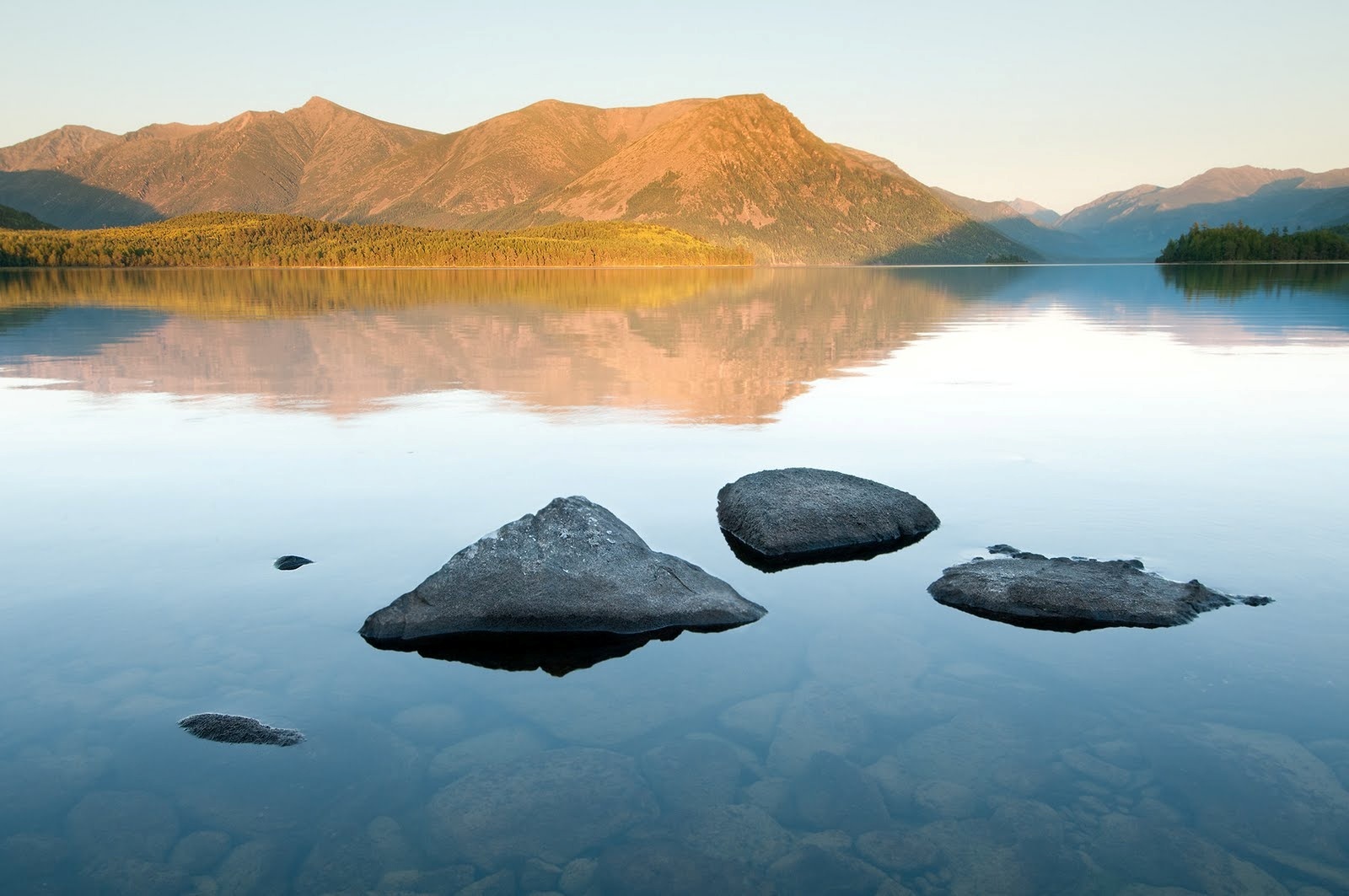
In the photograph above, the viewer’s eye is initially drawn to the stones in the foreground, but is soon dragged to the mountains in the background. While the stones, being darker, hold a lot of weight, the brightness of the mountain in combination with the area it covers holds an equal weight. The range of highlights and shadows in the rest of the composition only reinforce this balance. Without the rocks, there would be too much negative space in the foreground. Without the mountain, there would be too much negative space in the background. Even though this photograph is not symmetrical, it is still equally balanced.
Every type of balance below is a type of asymmetrical balance.
Tonal Balance
While we have touched on tones before, tonal balance can be seen most clearly in photographs that are nothing but black, whites, and grays. Balance can be seen in terms of contrast between the light and dark areas of an image.
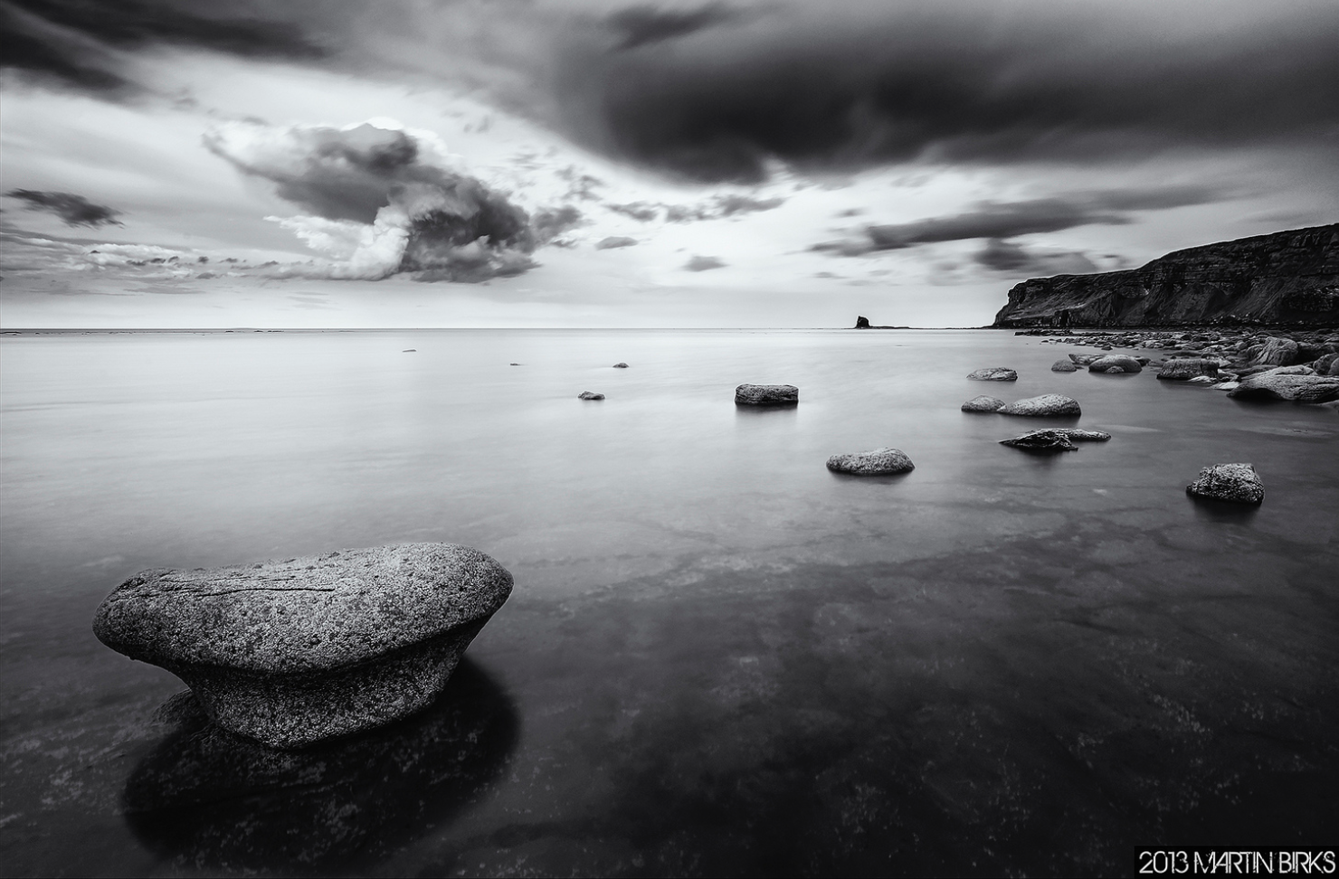
While the lower right side of the image is encased in shadow, the upper left is so bright that the two opposites balance each other, gradually guiding the viewer’s eye throughout the image. The darker mountain on the upper right side of the image balances the brighter rock on the lower left side of the image.
Color Balance
We’ve seen how different tones hold different weights, but did you know that different colors hold different weights as well? Think about it this way: if you were looking at an image that was half bright red and half muted yellow, which color would your eyes automatically drift to? For most of us, the answer is the red. Brighter colors are ‘heavier’ than neutral colors, which is why a pop of color within a photograph can easily balance out a scene that would otherwise be too heavy on one side.
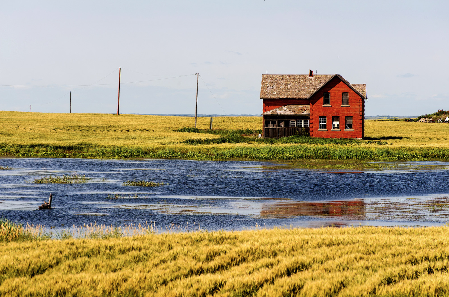
In the photograph above, the aggressive pop of red is balanced out by the blue and yellow colors in the rest of the image. If the ground were red and the house blue, the entire photograph would feel too overwhelming and unbalanced. Since there is only one ‘heavy’ color in the image—offset by a greater abundance of ‘light’ colors—the composition feels beautifully composed and balanced.
Conceptual Balance
If you’re just getting used to using balance in your own compositions, take time to perfect the above types of balance before branching out to the more philosophical type. It’s important to note that for a photograph to be conceptually balanced, it should also be either asymmetrically or symmetrically balanced as well.
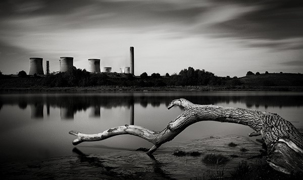
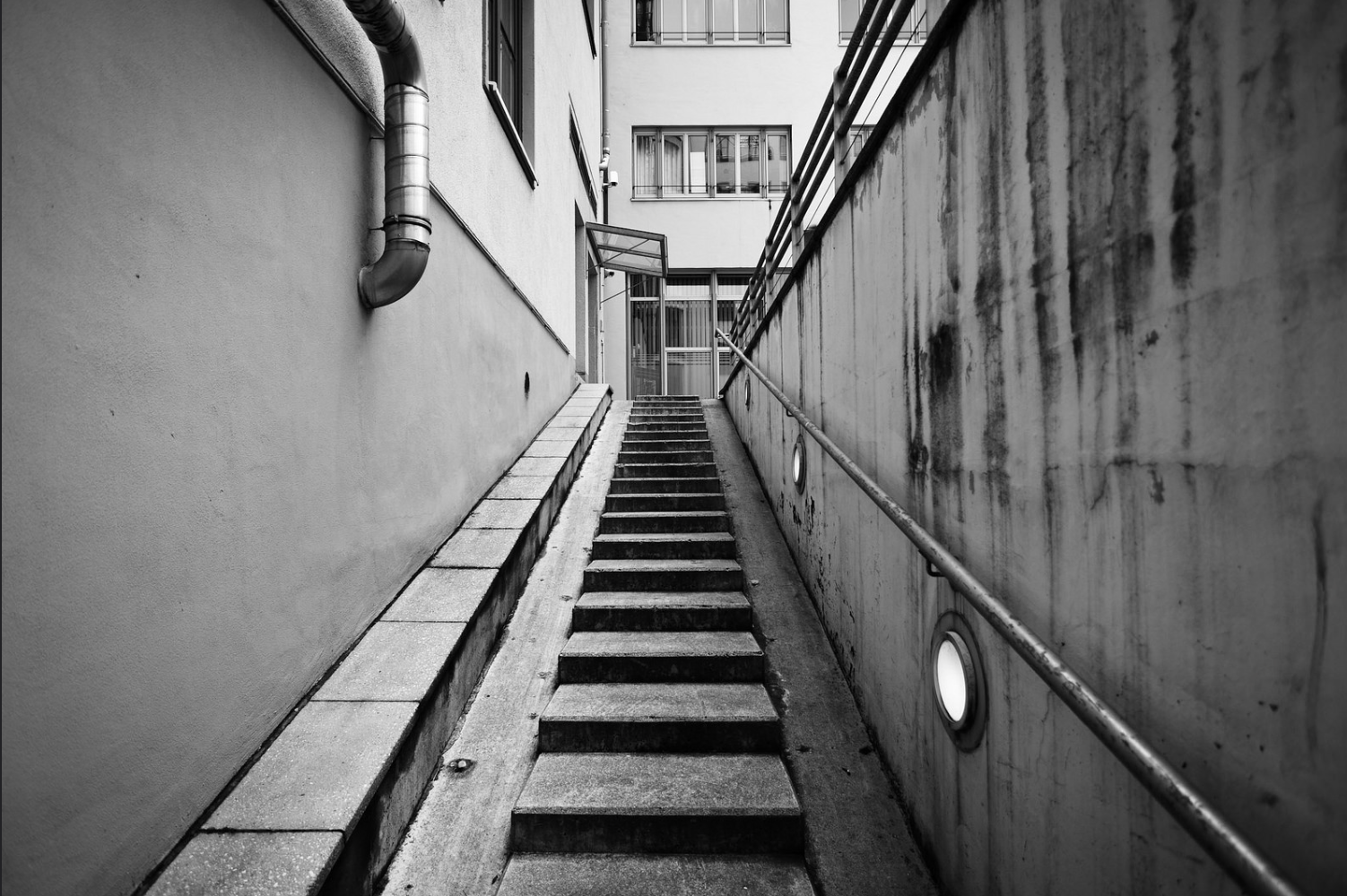
In the photograph above, you can see how the composition is beautifully tonally balanced. The deep shadows are perfectly countered by the bright shadows, and the darker industrial scene in the background balances the large, bright branch in the foreground. The balance doesn’t stop there, however. The branch, which is no longer alive, speaks to the effect of industrialization on the environment. The juxtaposition of industrialization and nature is only one of many ways that you can play around with conceptual balance in your own images. What other subjects do you think would make an interesting conceptually balanced image?
If you want to learn more about taking professional-grade photographs in a hands-on atmosphere, check out this workshop we offer.