
The digital revolution is a boon for graphic designers because it is constantly creating new job opportunities that may perfectly fit with one’s passions and daily activities. For instance, the age of static websites with text-only content is long past, and nowadays, there’s a huge focus in UI and UX that make surfing the web an enjoyable, easily comprehensible and interactive experience.
Whether it’s an ad, a movie poster or even an Instagram account, the key to its success lies in its visual aesthetics and data visualization forms an integral aspect of it. Which means there are more opportunities than ever for graphic designers who are whizzes with data visualization. Simply put, data visualization means representing information pictorially or graphically, so as to make it easier to understand and analyze or identify certain patterns. To do this, graphic designers will often work with a team of professionals to gather and interpret statistics.
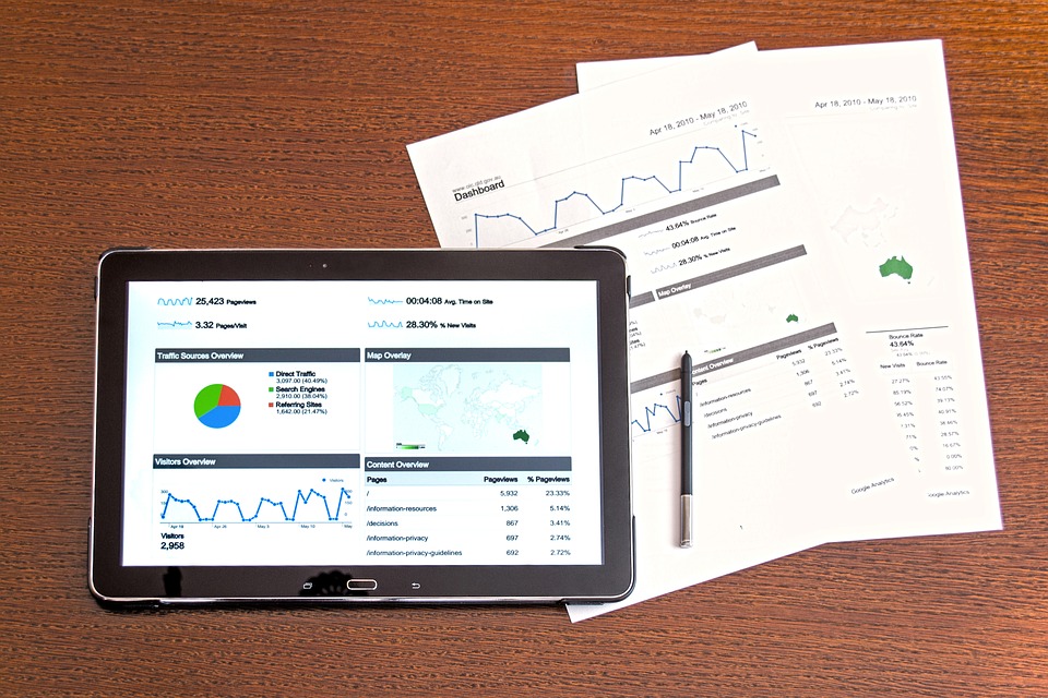
Suppose your team has collected a whole lot of customer feedback and statistics for a company. You have all the information but just showcasing pages of text at a company meeting won’t help anyone. What you can do is work with your team to turn the data into a clear, coherent, and visually appealing image — perhaps a pie-chart, a graph, an infographic or a map — so that other people viewing it can understand your team’s goal. Data visualization is a team effort to communicate in a fast and effective manner to enable readers to make informed decisions.
Think of it this way: learning becomes more fun when it’s supplemented with explanatory pictures and videos, right? This is why a power point presentation on a particular topic is way more useful than reading a textbook entry. It’s all about breaking information to bite-sized chunks and representing it pictorially so as to pinpoint certain trends, engage the audience, and get the message across ASAP.
If you’re considering a graphic design career with a focus in data visualization, here are some tips to bear in mind as you build up your skills.
1. Study How Images Work
Look up how images have always been used to represent information, ideas and thoughts — whether it’s ancient cave paintings, Egyptian hieroglyphics, medieval maps and illustrations, or even picture books and graphic novels where there’s a constant interaction between text and image. Next, look up the current trends in infographics or compare the visual representations of a particular topic to its text-only counterpart. Then take a look at what experts in the field have got to say such as Alberto Cairo, Edward Tufte, Max Roser, Mike Bostock and others. Also look at the online data visualization community such as this.
2. Cultivate Your Design and Analytical Skills

When it comes to design, choose courses that focus on color theory, branding, visual communications, color perception and data-ink ratio.
Remember it’s not just about being creative or having an aesthetic eye; rather, it’s all about conveying information quickly and efficiently. Master the use of software such as Adobe Illustrator, Corel Draw and database-management software such as Microsoft Excel. Learn a bit of programming such as JavaScript and its charting libraries like D3. And finally, take a course in statistical analysis and graphs as well as data analysis and profiling
3. Make You Own Stuff And Get Feedback
And as you read and learn, start making your own stuff as well. Take an infographic that you don’t like and redesign it, or take historical information and statistics and represent them pictorially to make a point.
Offer volunteering and freelancing services. If you work at a company, why not turn some of the company data to graphs and offer constructive feedback that will help the company to improve in a specific area? Share your work with others and repeatedly ask them for opinions — if they understood what you tried to convey and what would have made it easier. Be open to negative criticism as well and be on the look-out for self improvement.
4. Learn to Collaborate

Collaboration is the key to creating great data visualization. It’s important to remember that data visualization is not a lone endeavor. You will most often work with fellow professionals, clients, and companies to collect and interpret data for specific purposes, and you’ll need to learn to communicate clearly and cooperate effectively with your team to achieve your desired goal. Like any graphic design challenge, data visualization is an opportunity to problem solve. It will be much more fruitful if you learn to collaborate with your teammates who can contribute great information and solutions as you seek the best solution.
Data visualization is a vast field, and before you find your niche, you must have a good grasp of the basics. Be prepared to do a fair bit of independent learning and practice if you’re serious about mastering the skill set for creating awesome data visualization. If you’re enrolled in a graphic design course, try to use those classroom lessons when designing your own pie-charts and infographics as well as read up some pioneering work in the field. If there’s an area you have no knowledge about, consider signing up for an online course or tutorial. And always keep in mind that that both your design and analytical skills are of tantamount importance here.
Ready to learn more about graphic design? Check out NYFA’s graphic design programs!