As social animals, we humans have been using writing as one of the most fundamental forms of communication since our ancient ancestors. From those cave walls to the infinite pages of the Interwebs, typography has sure come a long way. Dating back to the 15th century when Johannes Gutenberg first developed moveable type and the printing press, making way for more decorative and practical typefaces and ordered page layouts, it was evident the world of words would forever be changed. By the Industrial Revolution, typography became all about the masses; typefaces became larger, catchier, and bolder to be used in signs, newspapers, and advertisements.
But in the current day where typography is used in almost every form of advertising and design, where it’s become so developed that it’s a full-time job for many designers and a stand-alone course at several universities, it’s virtually impossible for contemporary designers to keep up with each and every typeface that exists. And there are still new and original typefaces being created every day. But even with the prevalence of the discourse in our vastly digital landscape, designers who are well-versed on the matter are still quizzed on what typography actually entails by potential employers and more often than not, there are those who want to learn graphic design but neglect the importance of the topic in their work. So here are a few things every designer should know to ensure they’re prepared when discussing fonts with their clients (or critical naysayers) during the creative process
It’s All In The Eyes
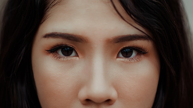
The science behind the powerful connection between our visuals and our brain isn’t something that’s been newly discovered with modern technology but the possibilities of visual affect in advertising has grown ten-fold in the last few decades with digital technology. Just as psychological studies confirm the correlation between colors and emotional responses, thus it being a huge determinant in how a brand is viewed, the style in which words and letters are formed works in the same way. Just ask Gary Hustwit—the filmmaker behind Helvetica (2007), a documentary about typography, design and global visual culture. “Helvetica. It’s everywhere: this typeface spells out tax forms, labels, street signs and company logos,” he says.
Typography is the vehicle through which things like tone of voice, gender, age, or emotion can be communicated, thus certain typefaces have their own personalities and are used to relay particular ideas. Additionally, according to a study on typography by Dr. Kevin Larson and Dr. Rosalind W. Picard at MIT, even very subtle changes in typography, like small caps, ligatures, kerning or old style figures are shown to measurably affect the way people react to a document.
Most Effective Typography

In a study conducted by Michael Bernard at Usability News, the most preferred typefaces for people were Verdana, Comic Sans, and Arial whilst the most legible font at size 12 was Courier and Arial at size 14. Another noteworthy experiment conducted by Errol Morris presented the same passage to 40,000 readers in six different typefaces. Readers who were exposed to Baskerville were more likely to agree with the passage, particularly when compared with Helvetica and Comic Sans.
Know The Basics
- Serif – This is the slight projection at the tip of a letter stroke that’s commonly at the bottom of the letter—sort of like “little feet.” This gives the eyes an easy transition or flowing motion through sentences.
- Sans Serif – The opposite of Serif, this font has no “feet” and is often seen as trendy, modern and streamlined but tends to be harder to read in smaller font sizes.
- Typefaces – Probably the most straightforward part of typography, it simply refers to the name of the style of text used. So basically like Arial, Georgia, or Chalkduster.
- Fonts – Although it’s frequently synonymous with the word “typeface” in the digital age, this technically refers to both a particular style of typeface and the decided width and height of that typeface. For instance, Cambria is a typeface, but the font would be Cambria, size 14, Italic.
- Tracking – This refers to the spacing between characters within a text, otherwise known as “letter spacing,” and is pretty standard. However, you can adjust it to affect text density.
- Kerning – Similar to tracking, but instead of the general spacing between characters, this refers to the white space between specific, individual letters and characters that may clash depending on the font design.
- Leading – This measures the space between where the letters sit i.e. the distance between a line of text and the line directly above and below it.
[su_note]Master the art of graphic design at NYFA’s Graphic Design programs, which you can learn more about by clicking here.[/su_note]